- by raggedflag |
- Painting And Drawing
- | Submitted on 10/16/2008 |
- Skip


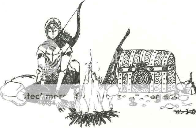
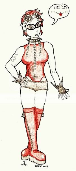
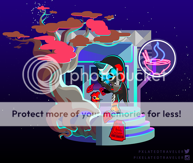
- Title: concept
- Artist: raggedflag
- Description: one of my character concepts
- Date: 10/16/2008
- Tags: concept character
- Report Post
Comments (7 Comments)

- Taurus_Chick64 - 07/24/2009
- make the shoulders look a lil' more straighter.. and the arm to the left is a tad off frum the right.. othr then tht i love it! <3 yummy
- Report As Spam

- Medical Plushy - 02/19/2009
- real cool
- Report As Spam

- Zombie Coon - 01/29/2009
- Hubba hubba
- Report As Spam

- Two-bit FoxTrot - 01/27/2009
-
o.O
HOTTT ABS!!!!! - Report As Spam

- Mr Emo Nemo - 12/19/2008
- hashu is right the tat on his shoulder is over the line were there shouldnt be a tat :"/
- Report As Spam

- Riku Tsumi - 12/19/2008
- I agree with Hashuhori, it's very good, the musscles are better than I can draw by far but the tattoos need to bend with them.
- Report As Spam

- Hashuhori - 10/28/2008
- you did a good job with proportions and the muscles, but the tattoos or whatever don't look like they're actually ON him because they don't bend with the muscles, they just have perfectly straight lines.
- Report As Spam