- by xXShugotenshiNoHitokageXx |
- Painting And Drawing
- | Submitted on 12/03/2008 |
- Skip
- Title: Creativity
- Artist: xXShugotenshiNoHitokageXx
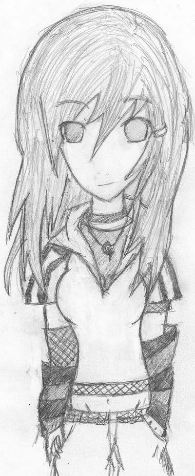
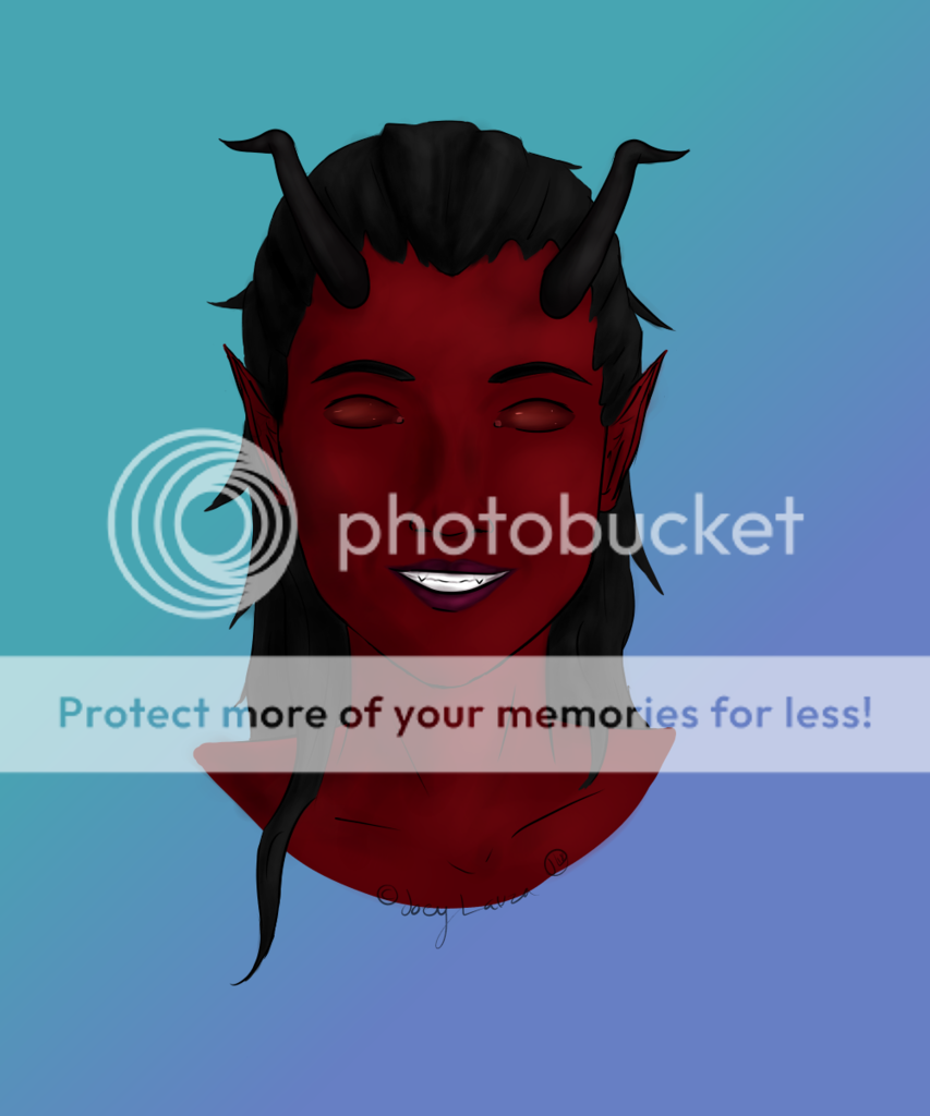
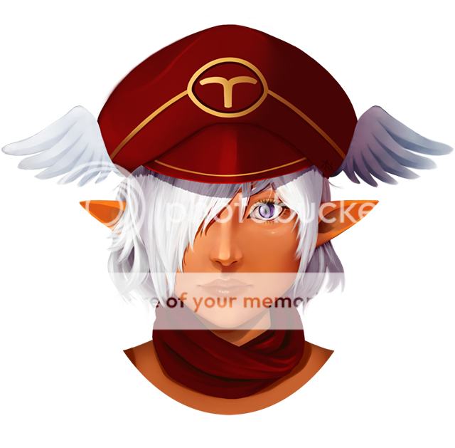
- Description: I really enjoyed making this. I learned a lot of different tricks using photoshop working on this. I feel I have come a long way from my first picture. ( located in my gallery, "L") I still don't like the face area though. Something is wrong with it but I can't see it. Point it out for me oh and leave lots of comments!! >.<
- Date: 12/03/2008
- Tags: flow
- Report Post
Comments (7 Comments)
- jellyelly - 08/27/2009
- ITS WONDERFUL!!!! FANTASTIC!!!!!!!!!!!!!!!!!
- Report As Spam
- Carbonbae - 12/06/2008
- her check has 2 much contrast on it it makes it look larger then it should be
- Report As Spam
- Laedt - 12/05/2008
-
i love the colorus and it is VERY creative! xD The hair is wonderful, love all the colours in there. The only few things that need a lil fixing would be the proportion of the top of the head and from the way you coloured the shoulders, it looks like the shoulder area should be wider( as in closer to the sides of the image) thats should fix most stuff x).
Ah sorry for the long comment, but now that i relook.. the face is fine O_o. Thats just the type of face this person has. so Good job !! - Report As Spam
- iDarkSaintSunday - 12/05/2008
-
hemm, it's very nice...
when i started looking on it it made me, feel all
~magic~.... so i realy don't know but it lookz realy great,
so i thing l will but it on a 5 X3! - Report As Spam
- Luci Stele - 12/05/2008
- u should have made a line on her cheek to show defintion as in her cheeks arent fat maby that might hep make a cheek bone line to make the cheek more triangular than round
- Report As Spam
- Lea Suzuka - 12/05/2008
- the cheek and the lips make the lips maybe anime like not real cause the rest of the picture is all fantasy so anime mouth of myabe a less detailed...
- Report As Spam
- RougeTheBat 83 - 12/05/2008
-
the Butterflies look cool in her hair and in the backround.
the bright colours Really go with the dark tone. - Report As Spam


