- by LostJavaBytes |
- Painting And Drawing
- | Submitted on 12/10/2008 |
- Skip
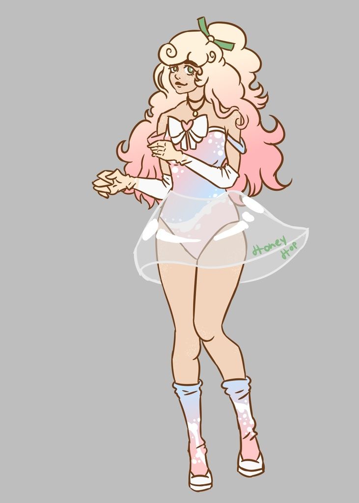
- Title: My Guardian Angel
- Artist: LostJavaBytes
- Description: Took about three or four hours all put together: 45 mins in front of the computer (drawin with .7 lead), 45 in study hall (inking with a free ballpoint pen you get at businesses), and about an hour and 15 mins for coloring (colored pencils that are NOT crayola). Now that I look back, her face looks a bit off, eyes too far apart maybe... I gave an honest attempt at shading and making appropriate shadows and wrinkles. They ended up blocks and lines, but I think they look fine. Comment and Rate!
- Date: 12/10/2008
- Tags: guardian angel
- Report Post
Comments (7 Comments)
- BleachLover334 - 08/20/2009
- wow that is awesome!!
- Report As Spam
- themorganashley - 03/12/2009
- Everything is excellent! I agree that the face is a little off, but the rest is rly good. 5/5
- Report As Spam
- InsainButterfly - 03/06/2009
- I like the concept, but the face is a little off. The nose is too far off the face, it should be more centered. Same goes with the distant eye. The actual face should be a tiny bit bigger, but not bat.As for the shading, with a light source like that, you want much more dynamic shading. Make the darkest parts dark and the lightest parts lighter. You tried only shading, make sure to add in highlights too. Try for a background next time too. It's still a great piece though! Nice work! :3
- Report As Spam
- Pet Senpai - 03/04/2009
- heh heh i love the drawing i think it's good 5/5
- Report As Spam
- LostJavaBytes - 02/21/2009
- her hair scares me o_O
- Report As Spam
- Junko Ishi - 02/21/2009
- its so beautiful
- Report As Spam
- Leakita - 02/10/2009
- nice!! ^^
- Report As Spam


