- by Sam the Morningstar |
- Painting And Drawing
- | Submitted on 06/02/2009 |
- Skip
Comments (3 Comments)
- martial_artist_09 - 12/17/2009
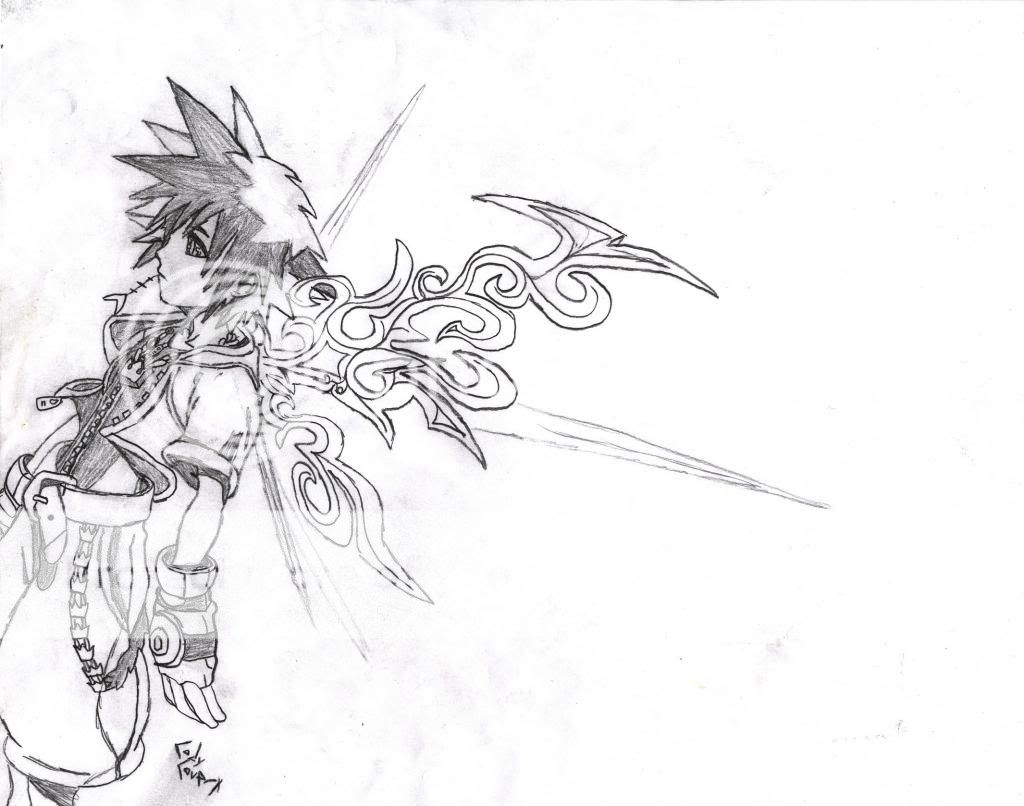
- it looks like he is lopsided, like...off balance...about to fall over...i agree with the back thing. otherwise you did good, not really my style, but good.
- Report As Spam
- Another dead accnt - 06/03/2009
-
nice .. that's my favorite supervillain to
i love this style - Report As Spam
- Vintage Mosaic - 06/02/2009
-
I like your style of, painting, is it? well, anyhow, it's very good and i love it, but right where his back curves in, there's a sharp ledge that makes him look like someone took a chunk out of him. You could probably fix it by redrawing the curve and making it less...curved.
- Report As Spam


