- by rawr_mental |
- Painting And Drawing
- | Submitted on 12/01/2009 |
- Skip
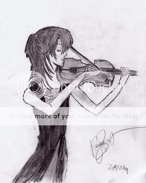
- Title: Ballroom Blues
- Artist: rawr_mental
-
Description:
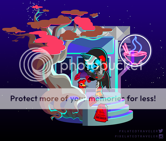
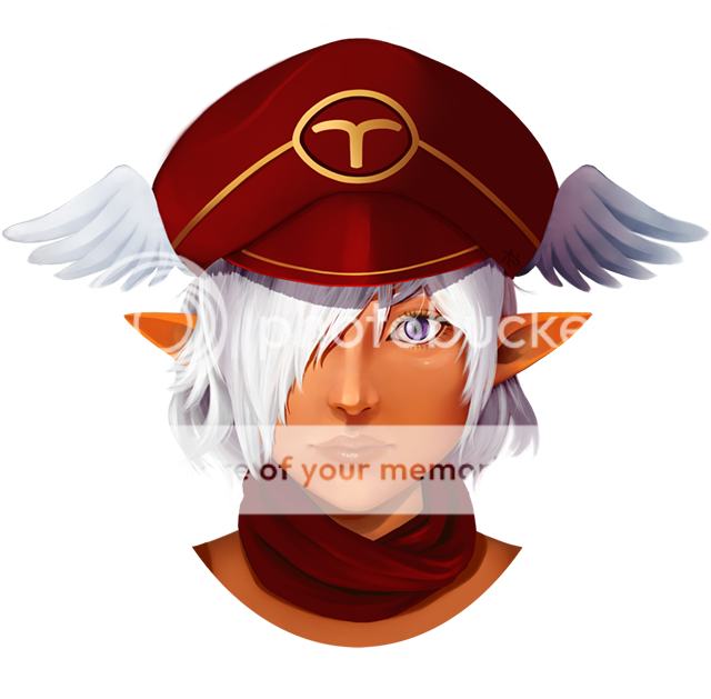
Which image looks better? The big one is is just the small one but with a filter and hue placed over it. Submitted this once in the old gaia art arena but it disappeared :(
I will start posting a few old pics up! :)
xx - Date: 12/01/2009
- Tags: ballroom blues anime
- Report Post
- Reference Image:
-

Comments (4 Comments)
- cliotropolis - 12/02/2009
- This is excellent. I see the filtered one as a manga page, and the colored as...a cover, maybe? I don't know that it's right to compare them.
- Report As Spam
- rawr_mental - 12/02/2009
-
hehe thank you ^^ I guess I should stick to un-filtered work xD Lesson learnt! Cheers guys biggrin
xx - Report As Spam
- Xiao_Ling_Nguyen - 12/02/2009
- I like the colored one the best. But the blue one is really pretty too. It has a cool effect
- Report As Spam
- dancinjlg - 12/01/2009
- I like the colored one better but the blue is kind of neat too.
- Report As Spam


