Comments (5 Comments)
- A Distorted Nightmare - 06/18/2010
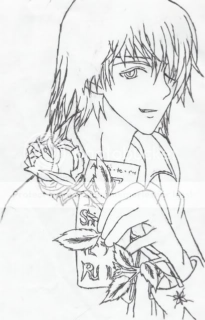
- A little dark, though if it came out as expected than yay for you. 4/5
- Report As Spam
- Arilena - 06/17/2010
- it's a sketch people. v.v
- Report As Spam
- Kimiko Hiramatsu - 06/17/2010
-
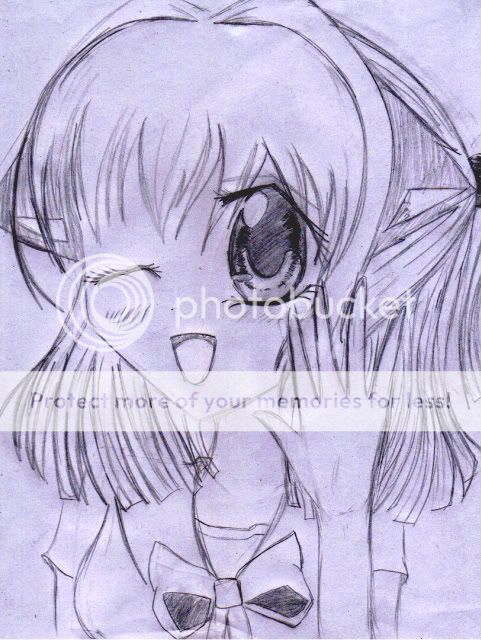
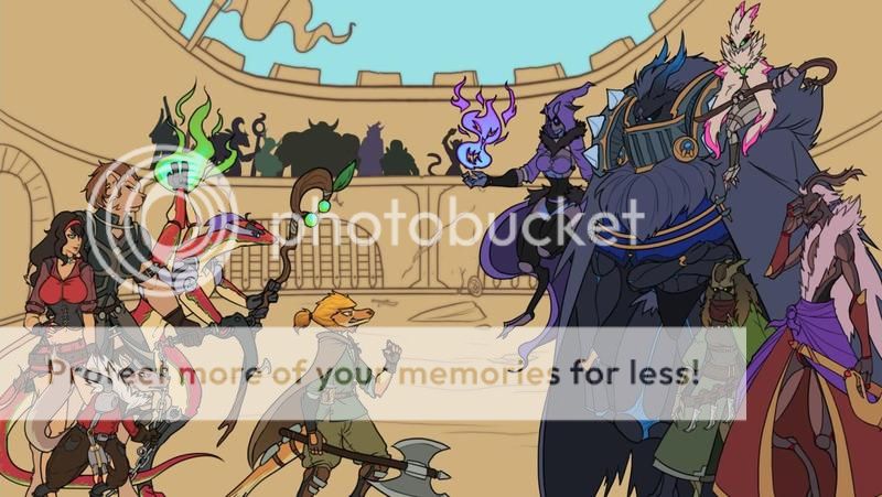
Aside from..the lack of colour, the bad paper choice, the bad scan, the over use of lines without any covering up and the format of image.
It's..fine, mostly.
The right side is a little biased to the overall image, properly what you were going for but it's not done well as the image is massively unfinished, the eye is good but lacks finer more subtle personality and detail which really gives an eye utter beauty the hair is greatly hard to distinguish and the lips are far far too large to the res - Report As Spam
- Arilena - 06/14/2010
-
hey peoples if ur gonna rate low then please comment why
- Report As Spam
- Arilena - 06/14/2010
- yes i'm quite aware of the horrible scan. xD i just took a pic of it with my webcam.
- Report As Spam


