- by [Oh] Snapple |
- Photography
- | Submitted on 07/21/2008 |
- Skip
- Title: Untitled
- Artist: [Oh] Snapple
-
Description:
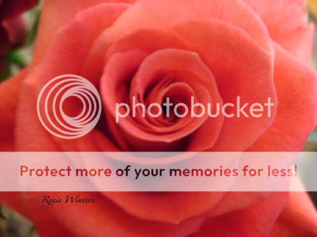
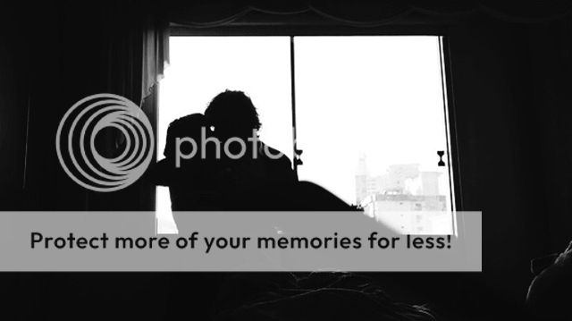
This was actually my first photo I took when I decided I was really interested in photography. Tell me what you think?
Its been purposefully not done color due to the fact that I thought it looked better in B&W and the absence of the color didn't accentuate the many veins in the rose. - Date: 07/21/2008
- Tags: rose first serious photo
- Report Post
Comments (7 Comments)
- faloobaloo - 07/22/2008
- I forgot to mention the lighting of the rose as well, I don't know if you purposely set it up like that, but it looks good too.
- Report As Spam
- [Oh] Snapple - 07/21/2008
- Anyone who likes my photos can check some more out at http://BangBangRawr24.deviantart.com
- Report As Spam
- XxPurexEctasyxX - 07/21/2008
-
By focusing on the center of the rose, the outer petals seem more father away and spaced out near the edges. Absence of color helps support that!
^_^ 5 stars! - Report As Spam
- TiggerTiger67 - 07/21/2008
- it looks cool and some ppl put stuff in the middle and thats not really creative but u didnt so it looks great
- Report As Spam
- RedFox211 - 07/21/2008
-
I like how you off-centered the flower in the photo, because most of the time when I see close ups of things like flowers its almost always centered.
5 stars for you. Vote back! - Report As Spam
- sherr i f u l l y - 07/21/2008
- ouu~ pretty. I like it alot. surprised
- Report As Spam
- LottiNesbitt - 07/21/2008
- You should submit that to a calendar biggrin
- Report As Spam


